
Uncategorized
6 Best Ways to Design Product Pages on a Magento Website
Jan
Product pages play a central role in any online store. Their importance influences purchasing decisions and they are often the destination for search engine users. Therefore, perfecting product pages to be as appealing as possible to customers is absolutely essential.
The Magento product page layout includes several key elements, such as product name, product collection, description, price, CTA, reviews, and upselling. Additionally, there is still plenty of room to integrate further improvements into the product page design.
We’ll present some fundamental principles of Magento product page design and how we use existing elements and expand them to achieve greater benefits for both your customers and your e-commerce business!
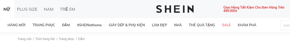
The product page must include breadcrumbs.
Some people find breadcrumbs too informative or simply not visually appealing, especially if they tend to split into two or more lines. However, breadcrumbs are quite useful for customers when they want to locate themselves within the website hierarchy or navigate between category and product pages.
Breadcrumbs become significantly more important when customers access a product page from a SERP (search engine results page). In such cases, Magento will generate a default “ Home/$(product-page) ” breadcrumb, but this isn’t really a great approach. By looking at the breadcrumb, customers will recognize the product’s position within the category, which is the primary category for that particular product. If a customer wants to see more products from the primary category, they will look at the navigation to find and guess which category the product belongs to.
A better approach is to set up breadcrumbs that display a full category hierarchy. Finding more similar products or product variations is now easier because customers can immediately recognize the category of the product they are viewing.
Product images
Online shopping means customers can’t see or touch the product in person. To help customers get a better understanding of the product, the first step is to provide high-quality images. Images should depict the product from multiple angles (this can be achieved with 360-degree rotating images). Online shoppers want a clear understanding of what they are buying, so high-quality product images are essential. Low-quality images can negatively impact purchasing decisions. Customers will quickly become disappointed when looking at a blurry, low-quality image because it will give them a completely false impression of the product.
A common tip is to include at least one image depicting the product placed in its natural surroundings, showing the product’s realistic proportions. This helps customers get an overview of its size or visualize how the product would look in its environment.
Close-up product photos
If a product has specific textures or details, close-up images are essential. Imagine a customer buying a guitar amplifier; he will certainly look at all the available knobs to see the amp’s features and effects, even before checking the product details in the description. If the product comes in multiple colors, ensure there is at least one photo for each color.
>> Read more : Product photography: How to shoot, background, and professional composition setup
The image has a zoom function.
One feature that is sometimes overlooked is zoom. More precisely, the zoom level, which is often inadequate. If a website offers a limited zoom level or the zoomed-in images are of low quality, customers will not get the image information they need.
Product description video
We suggest including more product videos, especially those that better showcase the product’s operation (such as a hair curler). This way, you can demonstrate how the product works and explain its features as if you were facing the customer directly!
Main shopping area
The shopping area is one of the most important sections of a page. It’s the first place customers can find any product information, pricing, availability, possible product variations, and of course, add products to their shopping cart. Beyond clearly displaying product names and prices, how can we design the page to improve the customer experience ?
Featured content on the product page
Highlighted content should always be showcased whenever possible. Whether it’s key product features, shopping-related information (such as shipping details), unique sales pitches, or similar information that can help customers make a purchase decision, it should all be displayed.
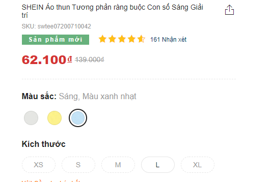
Shein Webstore displays unique value propositions as featured content .
For example, we’ve seen shipping-related information pushed to the bottom of the page and placed there exclusively. However, that information needs to be easily accessible on product pages because it can play a crucial role in purchasing decisions. Don’t expect customers to crawl to the bottom of the page to find it. We’ve found that if shipping information is the first thing customers see, they often abandon the purchase and leave.
Product variations
Magento’s configurable product options will be displayed in the main purchase area by default. However, identical products with different features will be configured as single products. For example, the same t-shirt or sneakers in multiple colors will often be listed as multiple individual products. This is actually a great approach to product listing because all variations can be explored immediately. However, product variations should also be linked together on the product pages themselves.
Imagine a customer stopping at the black shirt section (configured as a simple product) on the SERP and thinking, “I wish there was a blue one!” If all the variations were immediately visible, they would easily recognize that there was a blue version. However, if the variations were pushed to the bottom of the page and mixed in with other upsell products (which is often the case), they would be difficult to find. This quickly leads the customer to believe the store doesn’t have the product they’re looking for and they’ll leave the page immediately. Even if the user wants to try their luck and search for other variations, they’ll have a hard time finding them if they aren’t linked together.
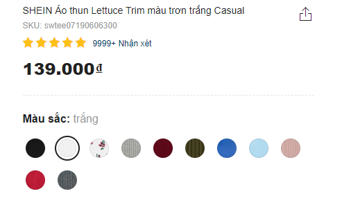
Shein displays alternative colors in the main purchase area. This makes them easy to find because they are at the top of the screen and near the top on mobile devices.
Product description layout
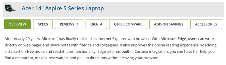
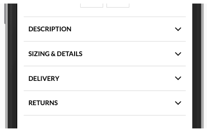
The first thing to consider when dealing with product descriptions is often the use of horizontal tabs. Horizontal tabs are useful for saving space and making the page shorter. Horizontal tabs aren’t useless, and sometimes they’re more effective than any other approach. However, the main drawback is that they obscure the content. Any kind of hidden content risks being undiscovered by some users, potentially causing them to leave the page. So, what other ways can we present product descriptions without obscuring the content?
Show all
This approach works if the page isn’t content-heavy, and the layout can be divided into 2-3 semantic columns that are usually perfectly suited to the view. It eliminates the risk of difficulty in discovering content, provides an overview, and makes it easy to find that content.
Long page
Typically, salespeople will need a layout that contains a lot of content. While tabs might seem like an obvious choice, a long-page approach is also a great method. The long-page trick means presenting a table of contents to help customers easily access different sections. Even if customers don’t see the table of contents, this is still a good fallback. All sections will always be visible to the customer even if they scroll down.
Mobile layout
Mobile viewports are smaller, so the design needs to be adjusted. A show-all approach can still be used here as long as the content is of a reasonable length to be easily scannable. However, longer content will require some to be removed because too much content in a small viewport creates a mess.
Collapsed content is similar to horizontal tabs when hiding content. However, because the website is scanned from top to bottom and the tabs are ignored as they provide section names, fewer problems arise since they already contain the information. When collapsing content, a clear indication is needed to show that the content has been hidden and how to display it again. This is usually done using directional icons (like chevrons).
>> See also: 6 Mobile User Experiences Developers Should Avoid
Customer reviews
Social proof brings a neutral voice to the website and provides deeper insights into the product. For example, when in doubt, customers will check reviews for more information before making a purchase decision. Often, reviews aren’t displayed on the website. It’s not uncommon to see sellers disable this feature for fear of negative reviews. However, besides product images, social proof is one of the most essential contents on the site. In addition to organic Magento reviews, consider using trusted third-party review services to convey more legitimate reviews.
Upselling and cross-selling
Similar to product variations, it’s crucial to offer replacement products and accessories on the same page, as it makes it easier for customers to find them. If a product doesn’t meet user expectations, this will keep them browsing further in your store and prevent them from leaving. Similarly, suggesting product accessories makes it easier for customers to find suitable products without unnecessary catalog browsing or comparing specifications to see if they’re compatible. Imagine a customer buying a new phone. They’ll certainly want a case for it. Why make them browse and search a different category when you can offer them compatible phone case options right on the same page?
